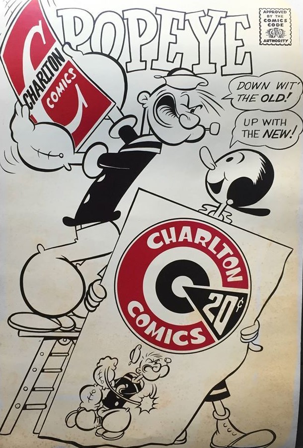
This charming poster by George Wildman would look dandy on my wall. Alas I don't have it. Sigh. It marks a significant change in the lore of comics, when Charlton Comics, longtime second-tier comic book producer and training ground for some of the field's best talents underwent a face lift of sorts. The bright red Charlton "C" had been successful for several years giving the company a stronger identity toward the end of the Silver Age. With the Bronze Age of comics in full swing and George Wildman stepping in as new editor of the line, sprucing up was in order. And that gave us the famous Charlton Bullseye, which gave its name to a few comics and a fanzine.

In the comic which Wildman drew, the change came when Popeye #122 was the last of that series to sport the old logo.

And Popeye #123 was the first of the series to sport the new look. It's almost lost in the busy cover design, but there it is nonetheless. Up with the new indeed!
Rip Off
No comments:
Post a Comment